I s h l a h I T

Kathu

Ray

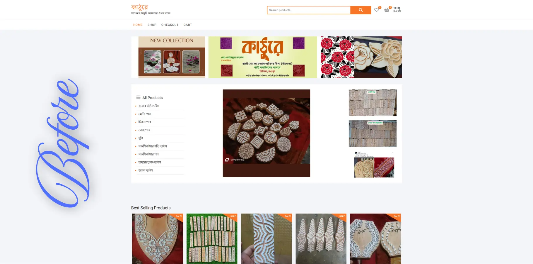
Kathuray Before Us
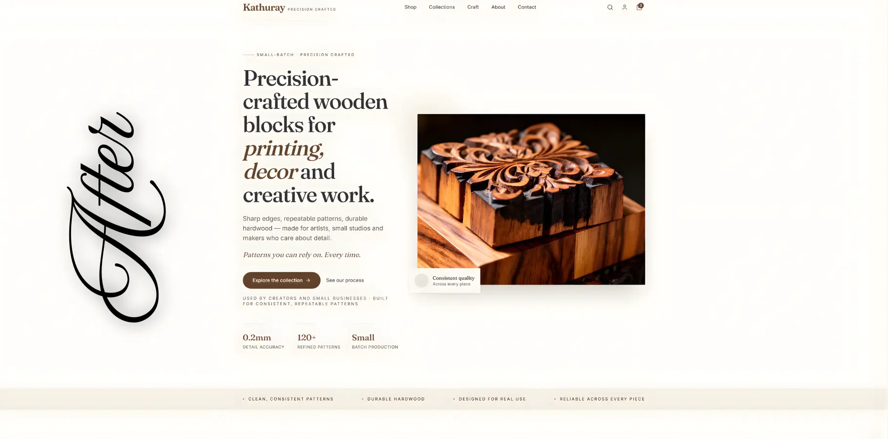
Kathuray After Us

PROJECT CASE STUDY — KATHURAY

❏ Intro

Kathuray wasn’t struggling because of product quality.
It was struggling because the experience didn’t match the product.

What should have felt like a refined, purpose-driven craft brand instead came across as a cluttered, repetitive storefront with no clear direction.

The opportunity wasn’t just to redesign the interface —
it was to reposition the entire experience.

This project focused on transforming Kathuray into a clear, confident, and conversion-focused brand—one that communicates value instantly and supports real-world use.
❏ The Problem

The original website suffered from structural and strategic issues:

Most importantly:

❏ The Goal

The objective was to:

❏ STRATEGY

Instead of designing for aesthetics alone, the focus shifted to:

🞔 Clarity over decoration

Every section must answer a question:

🞔 Show the result, not just the product

Users don’t buy blocks —
they buy patterns, outcomes, and possibilities

🞔 Turn precision into a strength

Rather than relying on generic “craft” positioning, the brand was reframed around:

🞔 Guide the user toward action

The design was structured to reduce hesitation and support decision-making.

Kathuray 2

❏ Solution

🞔 Refined Hero Section

The hero was redesigned to instantly communicate:

Clear messaging replaced vague branding, supported by a focused visual and strong CTA.

🞔 Trust Layer (Above the Fold)

A minimal trust strip was introduced to establish confidence early:

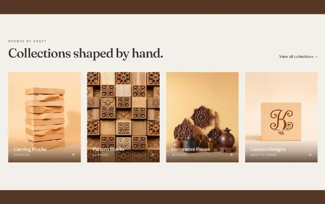
🞔 Structured Product Experience

Instead of overwhelming users with repetition:

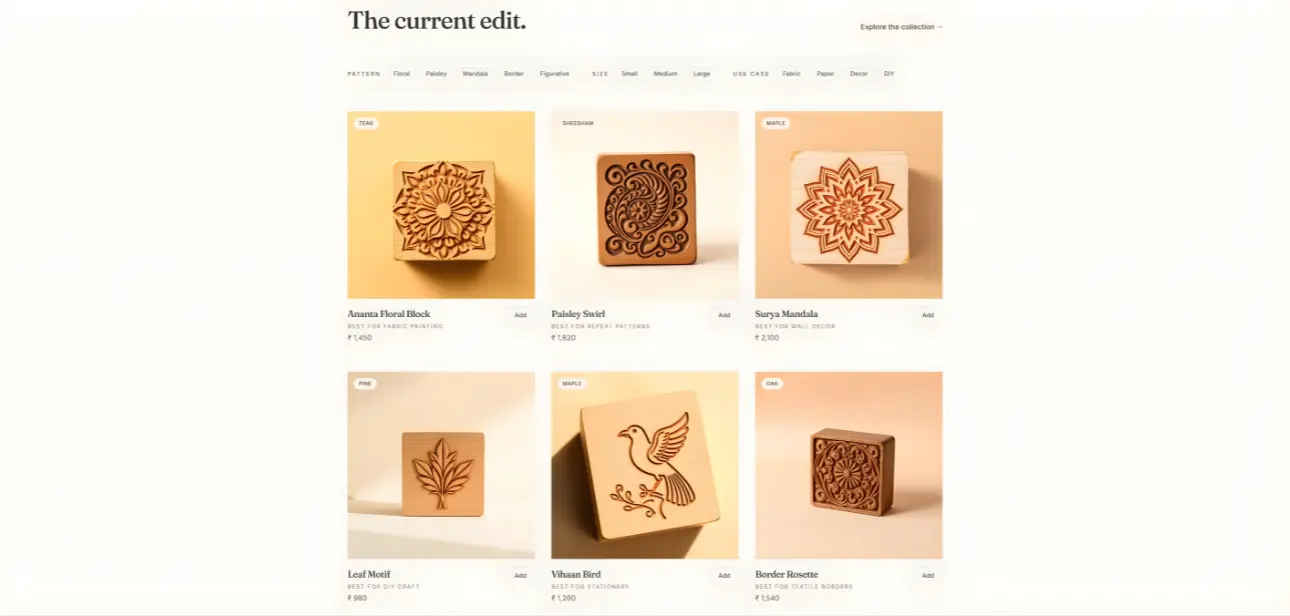
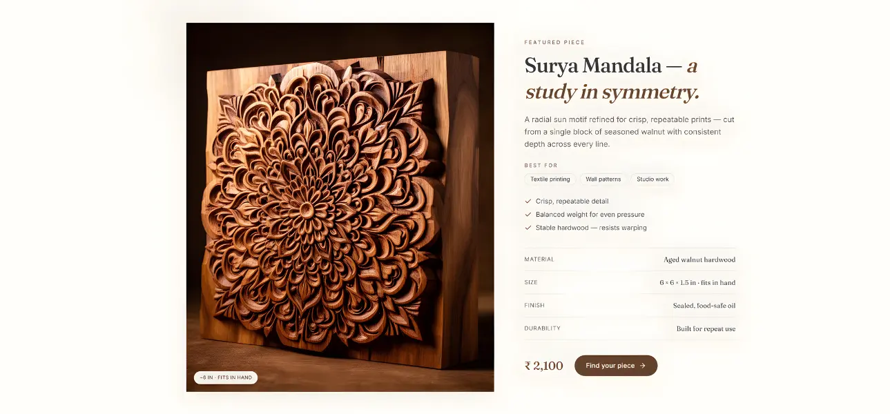
🞔 Pattern Preview System (Key Innovation)

A dedicated section was introduced to show:

This bridges the biggest gap in the original experience:
Users can now visualize outcomes before buying

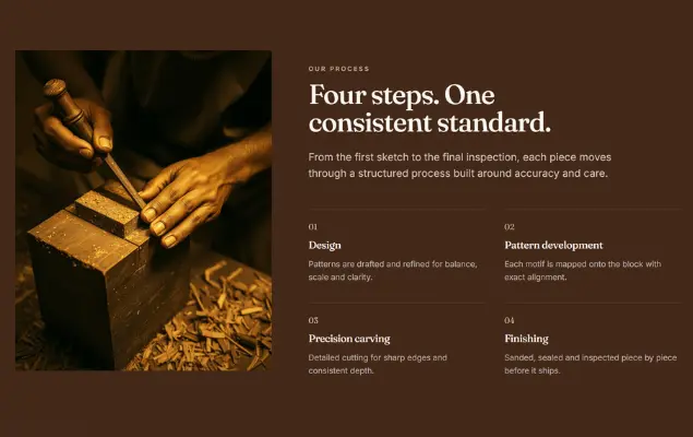
🞔 Detail & Precision Highlight

Close-up visuals were used to communicate:

Supported by subtle messaging:

“Precision in every detail”

🞔 Use-Case Driven Design

Instead of generic categories, the experience focuses on real applications:

🞔 Objection Handling

A dedicated section was introduced to address key concerns:

Answer:

Clean, consistent, reliable results

🞔 Brand Positioning Shift

The brand evolved from:
❌ Generic craft store

To:
Precision-driven creative tool for makers

Supported by signature messaging:

“Built for creators who care about detail.”

🞔 Conversion-Focused CTA

Final section refined to:

Regular
Medium
SemiBold
Blod

This Is Text Message
Medium Typography
Just Amazing
Awesome

❏ Design System

The redesigned experience delivers:

❏ CONCLUSION

Kathuray is no longer just a product catalog.

It’s a structured, intentional experience built around clarity, precision, and usability.

By focusing on what users actually need —
understanding, confidence, and outcomes —

the redesign transforms a simple store into a brand that communicates value and converts with purpose.

kathuray
Kathuray image 2
Portfolio Team
Portfolio Team

Let’s build something structured, clear, and reliable with ” IshlahIT Team “

Have a similar idea in mind?

Footer Image

We won’t sell you what you don’t need. We won’t overcomplicate your systems. We will focus on fixing problems and improving performance — consistently.

Contact Us

Valentin, Street Road 24, New York, USA – 67452

© 2024 – 2026 | Alrights reserved by IshlahIT

Email

Have a project in your mind?

09 : 00 AM - 10 : 30 PM

Saturday – Thursday

© 2024 – 2026 | Alrights reserved by IshlahIT

Email

Have a project in your mind?

09 : 00 AM - 10 : 30 PM

Saturday – Thursday