I s h l a h I T

NOU

RISHLY

NOURISHLY 1

PROJECT CASE STUDY — NOURISHLY

❏ Intro

Most meal subscription platforms try to do too much at once—resulting in cluttered interfaces and unclear user journeys.

Nourishly was designed with a different approach.

The focus was not on adding more features, but on simplifying the experience—creating a system where users can move from discovery to checkout without friction or confusion. Every section was carefully structured to guide decisions, reduce overwhelm, and maintain clarity throughout the journey.

❏ Overview

Nourishly is a concept web platform for healthy meal subscriptions, designed to simplify how users explore meals, customize plans, and complete orders.

The goal was to create a clean, structured experience that feels easy to navigate and reliable to use.

❏ The Problem

Most existing platforms present too many choices at once, making the experience feel overwhelming. Key issues observed:

These problems lead to hesitation, drop-offs, and a lack of trust in the system.

❏ Approach

The design approach focused on reducing friction at every step.

Instead of adding complexity, the goal was to:

Every decision was made to support clarity and flow.

NOURISHLY 2

❏ Solution

The platform was structured into focused sections, each solving a specific part of the user journey.

🞔 Clear First Impression (Hero Section)

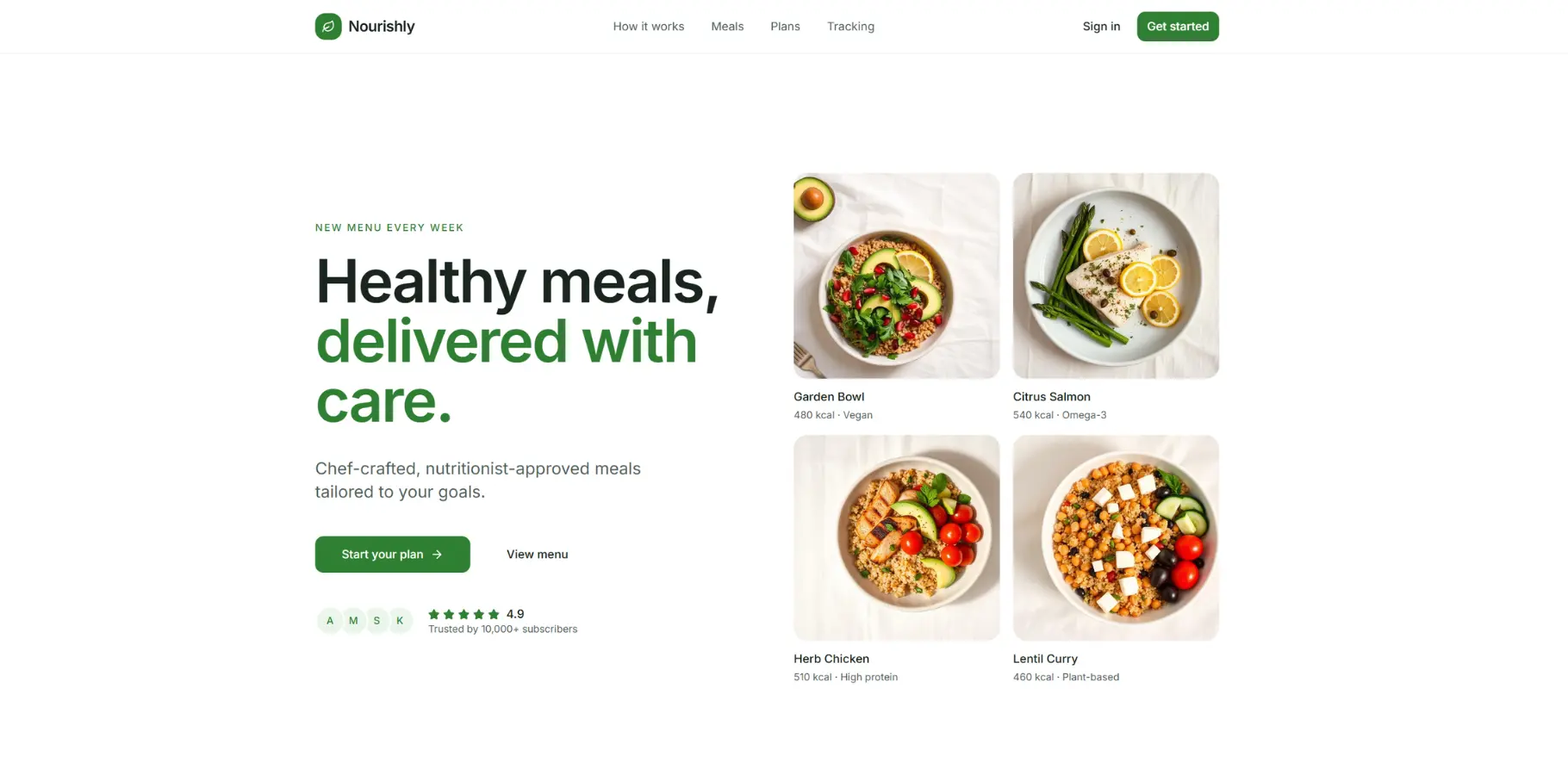
A clean and minimal hero introduces the product with a focused message and simple entry point.

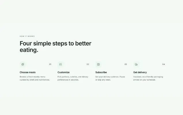
🞔 Guided Process (How It Works)

A 4-step system breaks down the entire journey into simple, digestible steps.

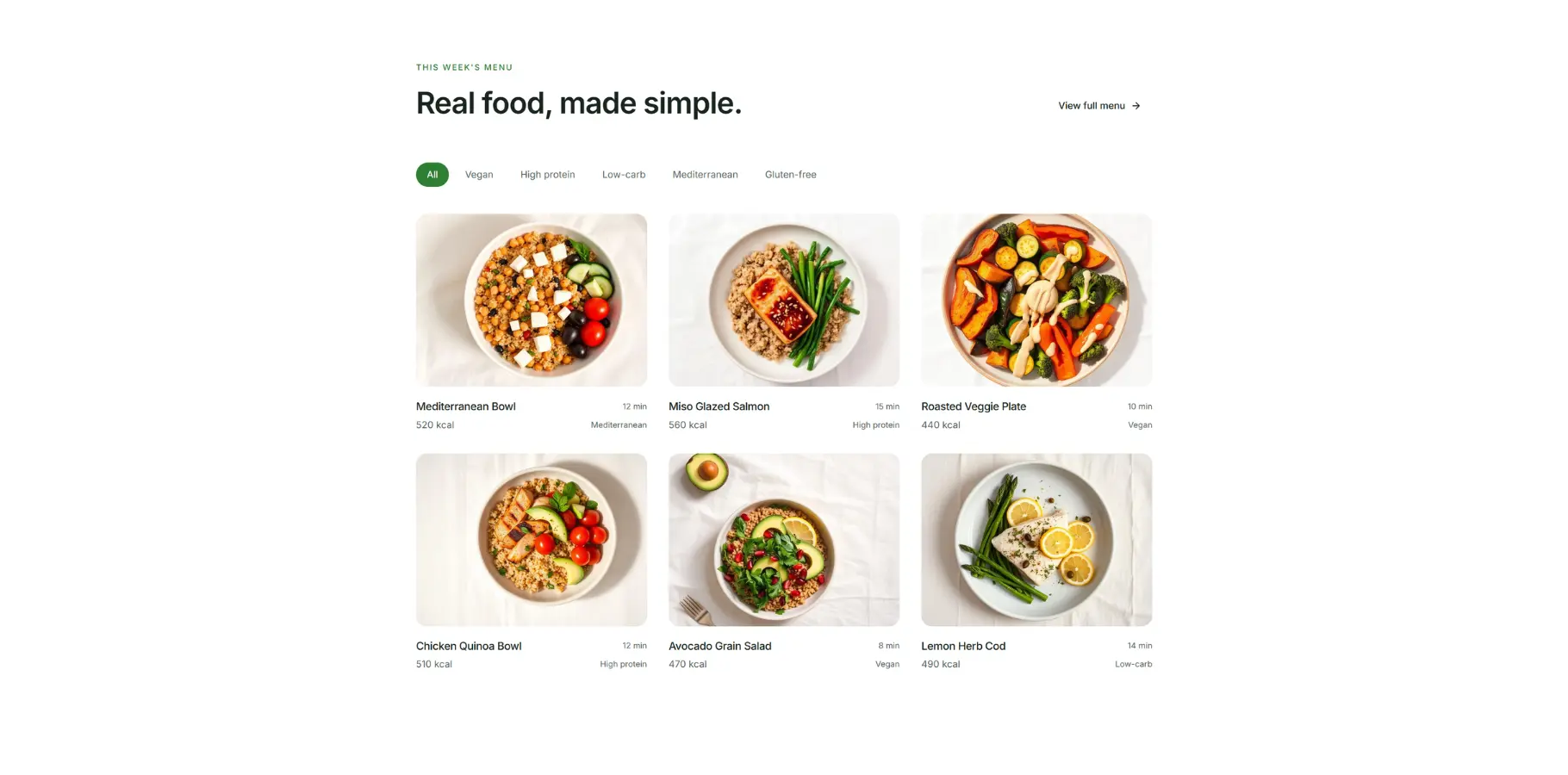
🞔 Structured Meal Selection

Meals are presented in a clean grid with categories and filters for easy browsing.

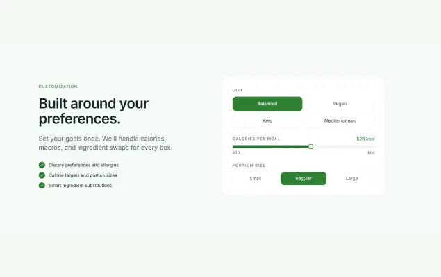
🞔 Personalization System

Users can customize preferences like diet, calories, and portions through simple controls.

🞔 Transparent Pricing

Pricing is displayed clearly with structured plans and minimal comparison friction.

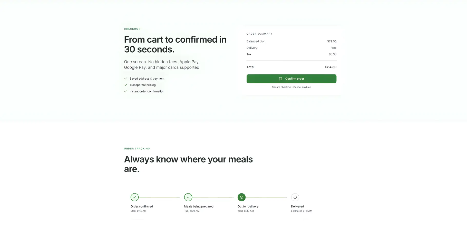
🞔 Frictionless Checkout

A clean and minimal checkout flow removes unnecessary steps and distractions.

🞔 Order Tracking

A simple tracking system provides clarity after purchase.

🞔 Trust & Support Sections

Testimonials and FAQs are placed strategically to reduce hesitation.

Regular
Medium
SemiBold
Blod

Strong hierarchy
Consistent style
Clear sections
Good spacing

❏ Design System

The visual system was kept minimal and consistent:

❏ Outcome

The final result is a structured and intuitive experience where users can:

❏ Conclusion

Nourishly was built around a simple idea—remove what isn’t necessary and refine what remains.

By focusing on structure, clarity, and controlled interactions, the experience becomes easier to follow and more dependable to use. Each section supports the next, creating a flow that feels natural from start to finish.

The result is not just a cleaner interface, but a more thoughtful and reliable system.
NOURISHLY
NOURISHLY
NOURISHLY 3
Team small
About Middle

Let’s build something structured, clear, and reliable with ” IshlahIT Team “

Have a similar idea in mind?

Footer Image

We won’t sell you what you don’t need. We won’t overcomplicate your systems. We will focus on fixing problems and improving performance — consistently.

Contact Us

Valentin, Street Road 24, New York, USA – 67452

© 2024 – 2026 | Alrights reserved by IshlahIT

Email

Have a project in your mind?

09 : 00 AM - 10 : 30 PM

Saturday – Thursday

© 2024 – 2026 | Alrights reserved by IshlahIT

Email

Have a project in your mind?

09 : 00 AM - 10 : 30 PM

Saturday – Thursday